


These days, you need to be able to find what you need for your business and buy it quickly. This is even more true in a busy salon environment.
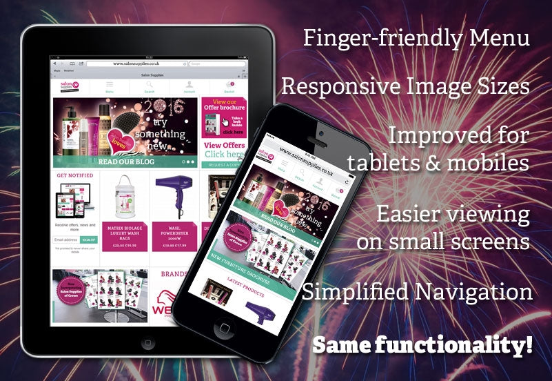
This is why we are delighted to introduce to you our new 'Responsive' website. That is, it adapts to the screen size you are using and optimises your browsing and purchasing experience - offering you a better service overall.
Here are just some of the new features you will find when visiting this website on your mobile phone or tablet.
 1. On smaller screens you will now see a handy menu bar that remains fixed at the top whilst you browse. The menu bar contains finger-friendly tabs to the 'hamburger' style menu which drops down to reveal any section of the website you might want to jump to. This includes our latest Offers and Contact details.
 2. Because the website is now responsive, this means that it should display everything in the best possible way for you to explore and browse through. On a tablet, items will be listed in rows of three while on a phone, listed singularly. This allows you to have a clear image of each product and easy to read details as you are scrolling through.


3. The product pages themselves are also easy to absorb, even on a small screen. The image of the product is large so you can see it in full and know what you are buying with product description underneath.
4. As well as the menu making things easier for you to find what you need, the drop down search facility is also handy. Allowing you to use your device's keyboard to type as normal.
Now that it's more common than ever to use tablets and mobile devices while at work in your salon (rather than a desktop PC) it'll be easier than ever to make orders, look up information on certain products and stay up to date with what's going on in your industry!
We'd love to hear what you think! So send us any comments or questions to
info@salonsupplies.co.uk
We hope you enjoy this new and improved browsing experience with us!
Share


